Sunday, February 24, 2008

A Scrap Challenge (or two)


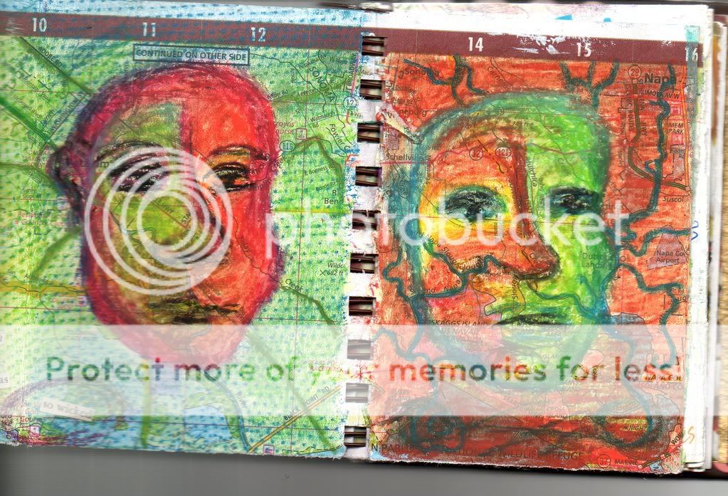
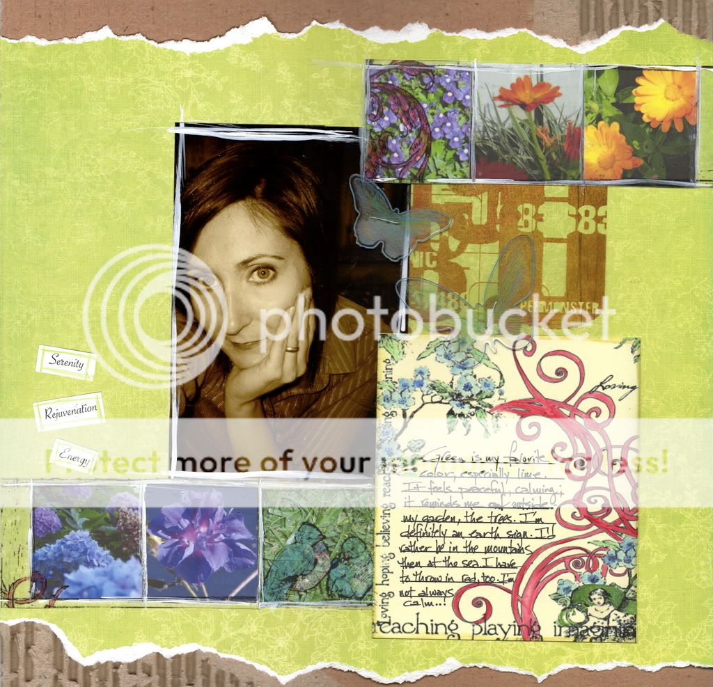
A new layout for the IOD Hybrid contest and the Scrap For A Cure color challenge. My DT friend a brilliantly talented designer, Rebecca, made a fabulous cardboard mini album with exposed corrugation, and I've been hooked on her technique ever since. The patterned paper is IOD, and the transparent accent strips are from their hybrid collection. I resized them, printed them out on sticker paper, cut them up and colored them with pencils. The journal box is a scanned portion of an IOD paintable, with journal lines added. I re-colored my photo in Sepia, and used watercolors and gouache to finish the layout. The butterflies are Heidi Swapp. The color challenge was to scrap your favorite color, so of course it's green. Green just happens to be the Arty Girlz challenge as well, this week! I had to add the splashes of red, because that one's a close second! The scan makes everything look a little crooked, since it was stitched, but I'm a little off myself, so I guess it works!

Saturday, February 23, 2008

Calendar Class was Fantastic!

Thank you to everyone who attended the calendar class today. I had a great time with you, ladies! If you would like to download a copy of the directions, you can get the PDF here. Remember that we did change up some of the papers, but the papers are in order in your pack. Please feel free to email me if you have any questions or problems with the download (click on my complete profile).

I hope to see you all again on Thursday, March 27 at 6:30 for the card making bootcamp. We'll make lots of great cards to fill that calendar with!  Even if you missed the calendar class, you don't want to miss the cards. You'll be set for birthdays and special events for the rest of the year!

Friday, February 22, 2008

Challenges


Mixed Media Monday had a texture challenge, Think Monday, Think ATC was insects, and the Artists Circle Yahoo group is working on folded ATCs, so here's a few pieces that combine all three. I love texture, but I tried slick textures (transparency) as well as the polymer clay seal, the handmade papers and the stitching. I love to draw bugs, so this was a really fun challenge for me.I liked the folded ATCs so much I used them as a lesson with my middle school art students. Hope you enjoy them! 
Stamp Credits: River City Rubber Works (bee), Quietfire (quote)

Monday, February 18, 2008

IOD Layout


Okay, here's the story behind this challenge. I saw it last month on the IOD blog, bought the papers at MDW for it, and intended to enter. Unfortunately, I found out that my old version of Elements wouldn't work on my new Mac, and the requirement was to use digitally altered photos on their layout sketch. I thought about scanning some I had done before and printing them, but they were stuck in mini albums, and it was the end of the month, so I let it go. Lo and behold, when I checked the blog in February, I found that it had been extended to this month. I still don't have a new version of Elements, so my poor little pics had some color saturation in iPhoto and text added in Appleworks drawing (a little old school, uh?).  I really like the label paper. I eliminated one of the elements on the sketch so more of it was exposed. All in all, not a bad layout, and it came together quickly! (can't beat that!)

Saturday, February 16, 2008

Birthday Calendar Class


Okay, here's my advertisement for my upcoming class at MDW. It is a perpetual desktop birthday calendar. Record those special days once, and you won't have to transfer them to calendars year after year. The cool part is you can store birthday cards inside, so you can just pull one out and mail it off. I'm even having a card making bootcamp on March 27 at MDW, so you can make the cards to put in there! This is a project that I have been meaning to do for the last year and a half, but never go around to it. I figured if I made it a class, I would actually do it. So, here's your chance to get organized, too. Trust me, you won't do it on your own! The class is from 1:30 - 3:30 at My Daughter's Wish in Pleasant Hill. Call 952-4437 to sign up.

Double Challenge


I like to combine challenges when I can, to see if I can stretch myself a little more. Created by Hand had this great house template this week, and Step Outside Your Box dared you to create something without any adhesives. My original intention was to collage the house, but without adhesive, that went out the window. So, to get the depth/layers I was after, I started with stamps. I then added paint and oil pastels, stamped into the wet paint, and added distress embossing power. More paint and finally the embellishments. Everything is held together with eyelets, brads and wire. I'm really not sure if it's finished yet, but I do like where it is going. Does it look complete to you, or does it need to be pushed further?

Wednesday, February 13, 2008

New Challenges for Valentines Day


I tried two new challenges this evening, combining the stamping challenge from Arty Girlz with the Wednesday Stamper valentine theme. These are the family valentines this year - the rocket for Max (Judikins) the bling for Madeline (Stampington) and the heart card for the DH. Boy, the colors really look terrible in that scan, but in real life they actually match, and are not so bright! I used the same Stampington background for the register love card, but I kissed it with their honeycomb stamp. I really liked the distressed look. Happy Valentine's Day!

Monday, February 11, 2008

Inspire Me Thursday - Faces


 Faces really do inspire me. My sketchbooks are filled with people and animals (bugs, too!), but not much in the way of plants or objects. My art is always about a story, a message, and people are usually my favorite way to convey that message. I must admit, though, that I really don't care if the viewer "gets" my message or not. When I am asked, "What does that mean?" I'm the obnoxious teacher that throws it back at you. What does it mean to you? I believe that art IS the interaction between the viewer and the piece. The only thing that really matters is if a piece touches you in some way - personal, humors, political, raw emotions, whatever. The connection with a piece is personal, and different for each viewer. So if your interpretation is similar to mine, great! If it's different, but you've made a connection, that's great, too. If you think it's a piece of crap, fine. It doesn't offend me. That's why there's lots of different artists in this world.
(ending lecture here. I am a teacher, you know. I can't help it.) 

So as you may have guessed, the theme for this (my first) Inspire Me Thursday is faces. I have to give props to the Green Pepper Press Street Team for this one, because the kit I put together for this crusade (see this post) made it so easy to grab my hard pastels and oil pastels, that haven't used in years, and play in my art journal. I have been doing so much design work lately that it felt fabulous to just draw. When I got out the fixative to set the first page, it sprayed out everywhere in a black, gloppy mess, leaving stains on the paper. I tried the old hairspray trick, and that deepened the colors and made more of the background stamping come through. It was all an accident, but I like it better then before!

Friday, February 8, 2008

Created By Hand ATC series


The Created by Hand challenge this week was to use their collage image, and since the Artist Circle Yahoo group is doing ATCs this month, I thought I would kill two birds with one stone. I started down this path with the Suzuki symbol that fit so nicely on the front of her chariot. After finding the flying pig, there was no going back. The Artist Circle assignment was to use one embellishment with an image, and I just had to use text. I can't seem to make a piece of art without it. The lighthearted approach to these was so refreshing, that I think Ethel may pop up in many more pieces to come.

Monday, February 4, 2008

Crusade #17


I'm finally posting an entry for Crusade #17! This challenge was to create a portable visual journaling kit. I actually keep a very small one in an oversized tin that I've used when traveling. Very simple - a couple of art pens, a pencil, mini tape, glue stick and stapler, a small ink pad, and a couple of stamps. For this year's Disney trip I added a couple more pens and a zip tote with watercolor pencils and a water brush. The pages above were done in October 2007.

BUT, seeing Michelle's kit inspired me to take a second look at the art bins. Matt had two for art school, and I've pulled supplies from them, but never really organized them for myself (now that I've stolen them!) I chose the small bin, took out the drafting and modeling supplies, and filled it with chalks, oil pastels, watercolor crayons, and lots of other fun things! I was inspired by Michelle's stash of magazine text to add my own. It makes perfect sense, because I always use found text in my artwork; why not journal pages? Thanks for the inspiration, Michelle!
(My new kit inspired me to actually do these journal pages for the IMT challenge!)

Blog challenge


Here's my entry for the card sketch challenge on A Walk on the Mild Side.  Great sketch, with cool retro graphics. I totally thought I'd be using a bold, retro print too, since I love that style, but I had this green scrap on my desk. It reminded me of fabric, so I looked through my enormous funky paper bin for a pattern or pattern instructions. I couldn't find either, but I did like the Chinese newspaper with it. I know it's Chinese, but together it reminded me of a kimono, hence the red paper ribbon. So there you have it, my design process in a nutshell. I usually start with a specific design plan, or color scheme, or stamp/image, and work from there. Sometimes it comes out as planned. Sometimes it takes a U-turn. Sometimes I wander down many roads before I discover something that works. 
Digging through that bin of paper made me realize just how much I've hoarded over the last few months. This is not my scrapbook paper, or collage images (I have separate files for those), just newspaper scraps, decorated napkins, hand dyed papers, and any other scrap that caught my eye. I have this intense love/hate relationship with paper. I love it, I collect it in all forms, I use it on almost all of my art pieces, and yet, after awhile, the piles just get to me. They collect in small quantities on my desk and counter,  until eventually, I want to just throw them all in the recycling and have clean, clear surfaces (although I must admit, they rarely make it into the bin).  I have to have it, I have to create with it, and yet clutter makes me feel unsettled. And so it goes on, day after day, unresolved...

Saturday, February 2, 2008

Jaime Marie

This evening I had the honor of becoming Jaime Marie's godmother. Jaime, you are the sweetest, happiest baby I've ever known. While most babies cry when the water is poured on their head, you seemed to enjoy it. You were captivated by the water in the baptismal pool and the lights of the candles. It was a long service, but you didn't fuss once. Amazing. Maybe you understood the beauty of the moment. I think children know God best. Maybe it's just your peaceful, joyful nature. It was wonderful to witness.

I wish you a life full of the splendor of the spirit. It is in you, and all around you, always.

DT Entry


A discovered a great blog called card positioning systems. It's like a weekly Becky Higgins sketch for cards, with examples of each sketch from her designers. Great source for ideas or when you need to put a card together quickly. There's a DT call, so I threw my two cents in. There's such competition for these now, especially since it's international, that I never really expect to make one, but you never know. It's also a good motivator to keep producing. I made two cards from her sketches. For the branch sketch, I made two versions. The first was the winter card, with the branch made from rolled tissue paper. It looks better in person - the tissue got squished a bit when I scanned it. It is the year of color for me, so I really liked the bright vellum leaves on the second card. Everyone was asleep, of course, when I made them, which was a real bummer because I would have appreciated a little input on which card to choose. I ultimately went with the color one, but later Matt actually said he liked the winter one better. So here they both are; which do you prefer?

Friday, February 1, 2008

4x4 Friday


The theme for 4x4 Friday is houses this week. This one was pure fun, as the door says. I put it together while I was waiting for some pages from another project to dry. It's just made from scraps from my desk (I love that I have a desk, now!) The scan's a little crooked, I know, but it kind of goes with the theme. Happy Friday!